Here are some great reasons to use health infographics in your content marketing strategy.
Health infographics are an engaging way to share information with readers. These graphic visuals contain useful data that is easy to scan and easy to retain. Infographics are an effective way to share health and wellness content on your blog, newsletter or website because people process images faster than having to read a body of text to get the same information. And that’s why they boost conversion rates.
So what exactly makes up a good health infographic?
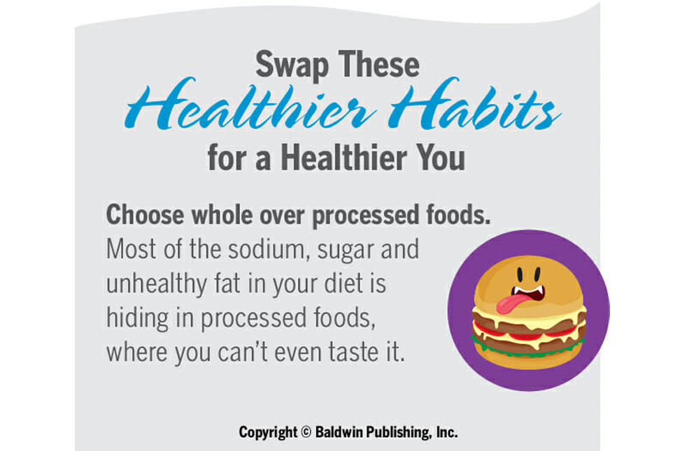
These graphics should be visually appealing. They should be bold and the images used to depict the information to be shared should be eye-catching and interesting. There’s lots of graphic content in an infographic, but there is text as well – and that text should be large and easy to read. In some cases, there are statistics, but there doesn’t have to be. Almost any useful information worth sharing can be designed in an infographic format.
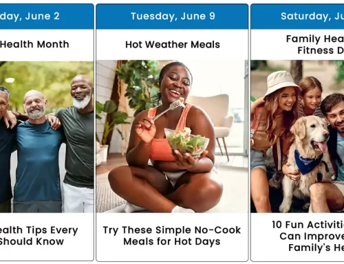
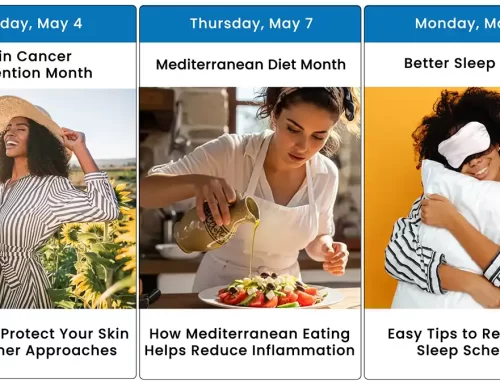
There’s really no right or wrong way to use an infographic as a means of sharing information. For example, you can educate readers about how to have a safer summer using fun graphics that depict a beachy scene. Or you can touch on a subject that may be otherwise difficult to address – namely, how the color of your pee can indicate whether you are dehydrated – by showing a series of droplets in varying shades of yellow.
Do you think infographics aren’t worth the time or expense to create? Think again!
One of Baldwin Publishing’s clients received a 30% click-through rate when they included one of our health infographics in their hospital newsletter. People’s interest was apparently piqued when seeing the vibrantly designed graphic and readers wanted to click through to find out more about the information it promised to share.
If you don’t have the resources, how can you benefit from using health infographics?
Most hospital marketers don’t have the staff, resources or budget to create their own infographics, even if they know they offer a good return on investment. That’s where Baldwin Publishing comes to the rescue!
We create informative health infographics that grab readers’ attention while providing them with important facts and tips. Our professionally-designed graphics include enticing images, easy-to-read text and valuable information.
When designing an infographic, we consider its appeal, comprehension and retention.
- Appeal is the engagement factor. The graphic needs to catch the eye of the reader and make them want to click.
- Comprehension is the ease at which people understand the information. Making the information easy to read and process is a must.
- Retention is the ability to remember the information. When readers remember what they see, they’re more likely to share it.
If you are in need of health infographics for your hospital blog or newsletter, Baldwin can help.